Expense Reporting System
UX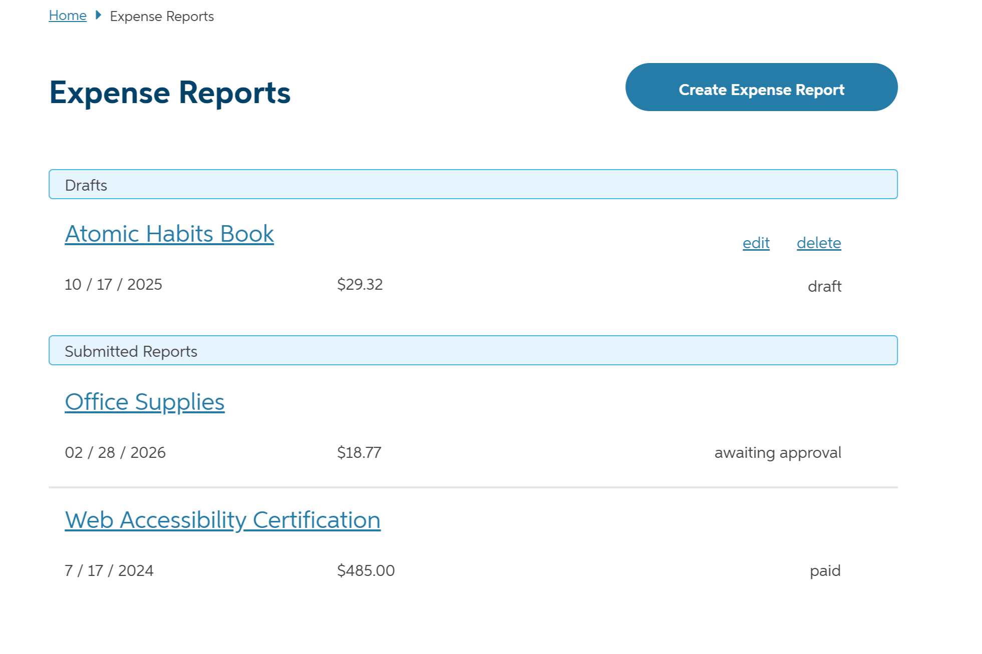
Overview
A redesign of the Auto-Owners Associate expense reporting system, focused on improving usability and streamlining the reporting process for employees.
As a UX Intern at Auto-Owners Insurance, I was tasked with redesigning the expense reporting system used by employees to submit their expense reports. The existing system was difficult to use and lacked clear documentation, leading to frustration and errors. My goal was to create a more intuitive and user-friendly interface that would simplify the reporting process and improve the overall user experience.
Through user research, usability testing, and iterative design, I was able to identify pain points and areas for improvement in the existing system. I then developed a new design that addressed these issues and provided a more streamlined and efficient reporting process for employees.
Technologies Used
Design Process
The Problem
The expense report system is a poorly designed interface that makes it difficult for employees to submit expense reports. There is limited documentation and user support available. I was tasked with identifying the users, use cases, problems, and opportunities for improvement in the existing system.
After interviewing employees, watching them submit reports, and analyzing existing documentation, I identified several key issues:
- Confusing navigation to the main reporting interface
- Discovability within the system was poor
- Input was being entered multiple times for one report
- Flow for uploading receipt images was unclear
- There were too many options within dropdown inputs
- One system was being used for multiple purposes, causing confusion
Most associates rarely used the system because expenses were not common. However, one group of associates used it regularly as they traveled in company vehicles and needed to submit expense reports for their trips.
The challenge was the redesign the system to meet the needs of all users, not just the most frequent ones.
Ideate
With the problems identified, I began exploring solutions in low fidelity, using crazy 8s and flow diagrams.
As fidelity increased, I refined the interface, pushing the boundaries of what fields were required and how they were presented.
The main reporting system was relocated, updating the navigation to be more intuitive.
A list of all expense reports was added to the main screen so users could see all their reports at a glance, including the name, date, and amount.
The list would be updated to show the status of each report.
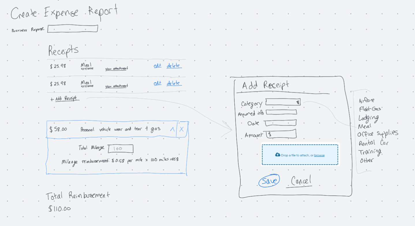
When creating a new expense report, all information remained on the screen so users could see all relevant information without having to navigate through pages. Dialog boxes and accordian components were used to input information depending on the user's needs.
Ideation focused on making navigation and the flow more intuitive, while making the interface feel more streamlined and reducing redundancy.
Prototype
A prototype was built using Axure RP 11.
During prototyping, I continued to iterate on the interface, refining the layout as things came together.
The prototype below shows the interface for less frequent expenses after refinements due to feedback from usability testing.
Test
To validate the design, I conducted a moderated usability study with associates using my prototype.
I wanted to know if they could find the relocated expense report system, understand the flow, and complete their reports without guidance. I gave each participant two tasks, testing the system's ability to handle regular travelers and less frequent, individual expenses.
Testing revealed two main issues:
- Inputs, like dates, were still being input multiple times.
- The system still didn't handle both scenarios (regular travelers and less frequent expenses) well.
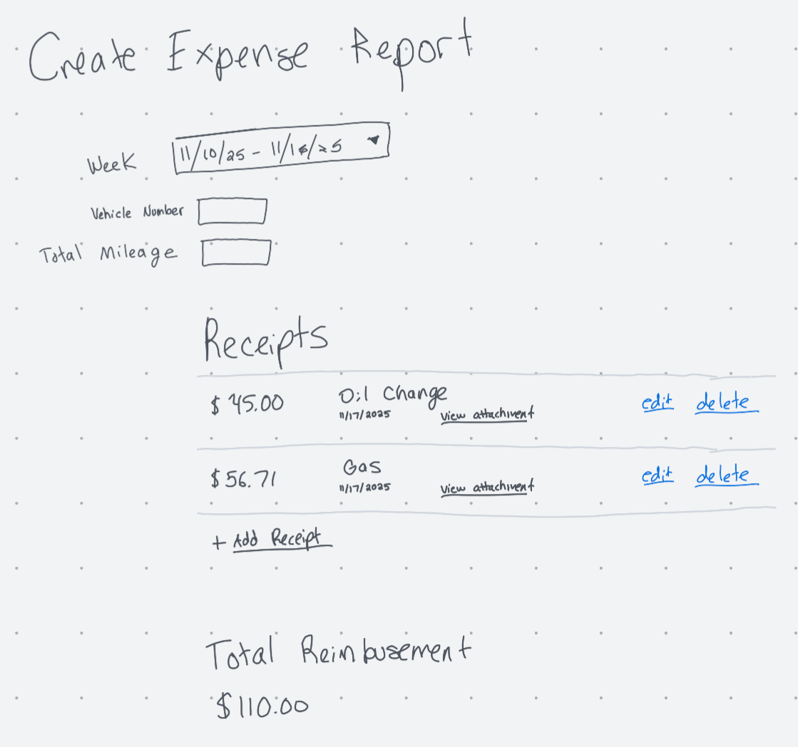
Based on these observations, I went back to the drawing board and iterated on lower fidelity designs. In the end, breaking the system into two separate systems, one for regular travelers and one for less frequent expenses, was the best solution. Based on the associate's job position, the system would automatically direct them to the appropriate interface.
This allowed each system to be optimized for its specific use case, improving usability, removing redudant fields, and reducing cognitive load.
The sketch shows the design for a weekly report for regular travelers.
After the final iteration, all problems with the original system were resolved, allowing all users to complete their expense reports without issues.