Labs@Home Application
UXOverview
A full-stack desktop application designed to help CMU computer science students complete lab assignments using virtual machines, without needing to understand all the technical complexity behind the scenes.
This project started from Professor Patrick Seeling’s research on virtualized lab environments and delta files.
The 5 step Design Process (Empathize, Define, Ideate, Prototype, Test) and the 10 Usability Heuristics were used to guide the development of the application. I conducted usability studies with real students to understand their needs and pain points, and iterated on the design based on their feedback.
This project challenged me to take a very technical system and design an experience that actually makes sense to users. I’m so excited to have the application utilized in upcoming semesters!
Huge thanks to Professor Patrick Seeling for the guidance and support throughout this project. Additional thanks to the Central Michigan University Honors Program for supporting this work and funding the poster presentation.
Technologies Used
Design Process
The Problem
Professor Patrick Seeling of Central Michigan University wanted to implement a virtual lab framework that allowed students to complete networking and computer science lab work on their own computers using a QEMU-based virtual machine. His research outlined a system using “delta files,” which capture changes made to a virtual machine. The professor could distribute pre-configured lab environments to students through delta files, and students could submit their completed work by sending their own delta files for feedback.
While technically sound, the framework required students to manually interact with virtual machines and delta files through a text-based environment. This complexity risked creating a barrier between students and their assignments, shifting focus away from learning objectives and toward technical setup.
The challenge was to design a Windows-based desktop application, stored within each student’s CMU network drive, that simplified this process.
Ideate
With user needs defined, I began exploring how to simplify a technically complex system (QEMU + delta files) into an intuitive student experience. After mapping out flows and sketching different approaches, I reduced the experience to three simple actions:
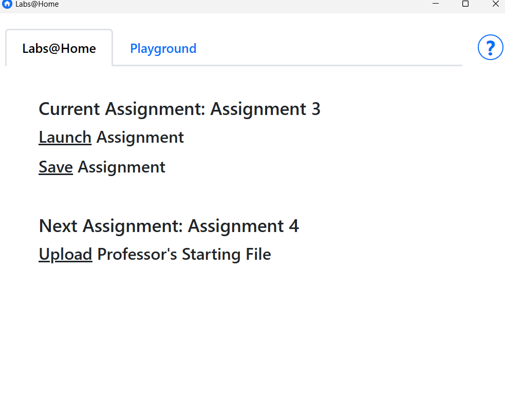
- Launch current assignment
- Save assignment
- Upload professor’s starting file
Everything else, like delta file management and system commands, would happen behind the scenes.
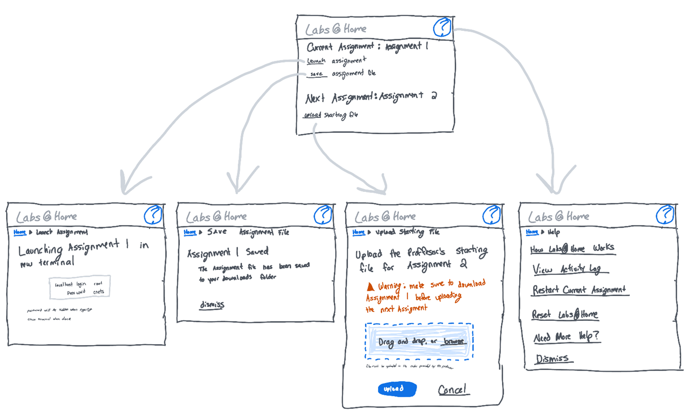
I also removed technical language like “overlay files” and “QEMU” from the interface. Students don’t care how their work is stored. They care about completing assignments. My goal became making the system feel straightforward and predictable.
While sketcing, I relied heavily on Nielsen’s usability heuristics to guide key decisions:
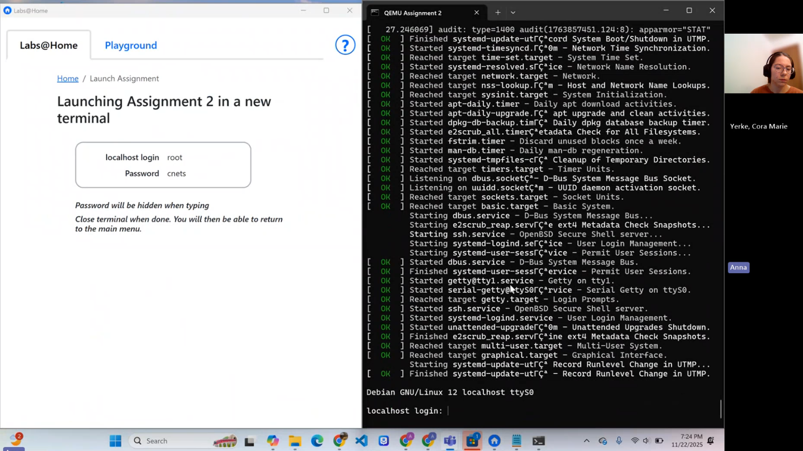
- Visibility of system status: The interface clearly shows when something is processing, so students always know what’s happening.
- Error prevention: I added guardrails to prevent issues like launching multiple terminals
- Recognition rather than recall: Important information, like virtual lab login credentials and assignment numbers, is shown directly in the interface so students don’t have to remember it.
- Aestetic and minimal design: I removed technical language and unnecessary elements to keep the interface focused and distraction-free.
The early sketches focused on clarity and reducing friction, especially around assignment progression.
Prototype
Once the flow was outlined, I moved into building the prototype.
I used Tauri with a Rust backend and React frontend. Rust handled system-level operations like launching the virtual machine and merging files. React handled the interface and user interaction.
I built the application iteratively, implementing small pieces and testing them immediately. This helped me catch both technical bugs and usability issues early, instead of discovering them all at the end.
I also added lightweight persistence (JSON files) to track assignment progress and log user actions. This supported usability decisions like displaying assignment numbers and giving users visibility into what had happened.
Test
To validate the design, I conducted a moderated usability study with CMU computer science and IT students.
I wanted to know if they could complete assignments without guidance, and if they understood how to progress to the next assignment. I also wanted to observe where they hesitated or became confused.
Watching students use the app was incredibly insightful. Some issues were technical, but others were purely UX:
- Students weren’t sure what the “Playground” was.
- They didn’t know what the saved file in their Downloads folder represented.
- One student navigated away while the virtual machine was still running.
- The Help page explained how the system worked, but not what students should actually do.
Based on these observations, I:
- Clarified button emphasis and labels
- Renamed saved files to include student IDs
- Disabled navigation while the terminal was open
- Rewrote Help content to focus on user actions first
Five participants were enough to surface the majority of usability issues and guide meaningful improvements.